
Transform your space: discover australia's on-trend interior paint colours for 2024
9th Feb '24 • By Service.com.au
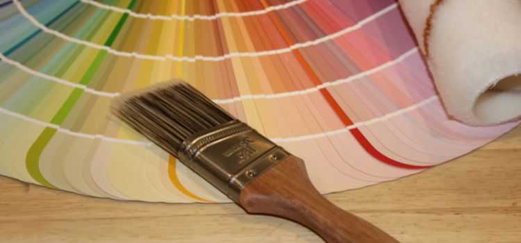
As we embark on a journey through 2024, the world of interior design continues to evolve, with Australia leading the charge in embracing innovative colour trends.
From serene neutrals to bold statements, the palette of popular interior paint colours for this year offers something for every style and personality. Let's delve into the hues that are set to dominate Australian homes in 2024, providing you with the inspiration you or your painter need to transform your living space.
Article Summary
- Calm Neutrals
- Earthy Tones
- Moody Blues
- Sunset Hues
- Modern Metallics

Calm Neutrals
In 2024, neutrals remain a steadfast choice for those seeking a timeless and calming ambience in their living spaces. Shades like "Soft Linen" by Dulux, "Warm Taupe" by Taubmans, and "Cosy Grey" by Wattyl are popular picks, offering versatility and a sophisticated backdrop for any décor style. Whether you're aiming for a minimalist aesthetic or a cosy retreat, these neutrals provide the perfect foundation.
Earthy Tones
Embracing the beauty of nature, earthy tones continue to make waves in interior design circles across Australia. Colours like "Sage Green" by Haymes Paint, "Terracotta" by Porter's Paints, and "Earthy Brown" by British Paints bring warmth and vitality into homes, connecting inhabitants to the natural world. Paired with organic materials and indoor greenery, these hues create a harmonious and nurturing environment — a perfect example of how colour psychology intertwines with interior design.
Moody Blues
For those craving a sense of drama and depth, moody blues are making a bold statement in 2024. Shades such as "Midnight Navy" by Resene, "Slate Blue" by Bristol Paints, and "Deep Indigo" by Murobond add sophistication and intrigue to interiors, evoking a sense of mystery and elegance. Whether used as an accent wall or as the primary colour scheme, these deep blues command attention and create a striking visual impact.
Sunset Hues
Injecting warmth and vibrancy into living spaces, sunset hues are lighting up interiors in 2024. Colours like "Burnt Orange" by Haymes Paint, "Tropical Coral" by Taubmans, and "Golden Yellow" by Porter's Paints infuse rooms with energy and positivity, reminiscent of a breathtaking sunset. Perfect for creating focal points or infusing small doses of colour, these hues add a playful and uplifting touch to any home.
Modern Metallics
Incorporating metallic accents into interior paint colours is a trend that continues to gain momentum in 2024. Shades such as "Champagne Gold" by Dulux, "Satin Silver" by Wattyl, and "Brushed Copper" by British Paints introduce an element of luxury and glamour to living spaces, reflecting light and adding depth. Whether used sparingly as trim or in larger expanses, modern metallics elevate the aesthetic of any room.
As we navigate through 2024, Australia's interior design scene is ablaze with an array of captivating paint colours that cater to diverse tastes and preferences. Whether theme you're drawn to, there's a palette waiting to transform your home into a stylish sanctuary. Embrace these trending colours to breathe new life into your living space and make a statement that reflects your unique personality and sense of style.
Need help finding the right painting business for your needs? Compare multiple quotes today.
Get free quotes in minutes.
Get quotes from our qualified and licensed tradies Australia-wide.
FAQs
1. How do I choose the right interior paint colour for my space?
Choosing the right interior paint colour involves considering factors such as the room's purpose, lighting conditions, existing furniture and decor, and personal preferences. Start by collecting paint swatches or samples to see how they look in your space under different lighting conditions. Additionally, consider the mood you want to create in the room. Warm colours like reds, oranges, and yellows can make a space feel cosy and inviting, while cooler colours like blues and greens can evoke a sense of calmness and relaxation. Don't forget to test paint samples on your walls before making a final decision.
2. How can I make a small room appear larger using paint colours?
To make a small room appear larger, opt for light and neutral paint colours like "White on White" by Taubmans or "Alabaster" by Dulux. Lighter colours reflect more natural light, creating an illusion of space and openness. Additionally, consider painting the ceiling the same colour as the walls to eliminate visual boundaries and make the room feel more expansive. Avoid using dark or saturated colours, as they can make a small room feel cramped and claustrophobic.
3. What is the best way to prep a room for interior painting?
Preparing a room for interior painting is essential for achieving professional-looking results. Start by removing furniture, wall decorations, and outlet covers from the room. Clean the walls thoroughly to remove dust, dirt, and grease using a mild detergent and water solution. Repair any cracks, holes, or imperfections in the walls with a spackling compound and sand them smooth once dry. Apply painter's tape to protect trim, baseboards, and adjacent surfaces from paint splatter. Finally, lay down drop cloths or plastic sheeting to protect flooring from drips and spills.
4. Can I paint over dark-coloured walls with lighter paint colours?
Yes, you can paint over dark-coloured walls with lighter paint colours, but it may require additional preparation to ensure proper coverage and colour accuracy. Start by applying a high-quality primer specifically formulated for covering dark colours. This will help seal the existing colour and create a smooth base for the new paint. Once the primer is dry, apply multiple coats of the lighter paint colour until you achieve the desired hue and coverage. Be sure to allow each coat to dry completely before applying the next one.
5. How long does it typically take for interior paint to dry?
The drying time for interior paint can vary depending on factors such as humidity, temperature, and the type of paint used. In general, water-based latex paints dry faster than oil-based paints. Latex paint typically dries to the touch within one to two hours and can be recoated after four hours. Oil-based paint may take longer to dry, usually drying to the touch within six to eight hours and allowing recoating after 24 hours. However, it's essential to follow the manufacturer's instructions on the paint can for specific drying times and recoating intervals.