
10 modern paint colours for your bedroom
29th Jun '20 • By Shreya Kulkarni
If you need a change in the bedroom, you don’t necessarily need to revamp the entire space and break your bank. New bedroom furniture, decorations and flooring can cost a pretty penny at the end of the day. And you might not even be ready to make such a dramatic change to start with. Simply changing the colour of your walls can help brighten the place, change the ambience and give your space a major facelift.
What colour scheme do you prefer? Are the colors soft and dreamy? Are they bold and vibrant? Are they muted and serene? The bedroom is a wonderful place to introduce a color scheme that fits the mood you want to feel most while you’re there. This is different for everyone, but the concepts behind selecting the bedroom color palette are pretty standard. If you’re not sure what kind of paint to use or what color combinations go well together, don't worry we have something for everyone! Find out how much an interior painter cost. We have amazing options of some of the best modern paint colors that are sure to get you inspired! Get ready to get rid of the boring plain walls with the help of local painters!
1. French Grey
Grey works well in rooms with lots of natural light, high ceilings, light floors and a large space. French Gray is really much more green than grey, but sways between the two depending on the light and time of day. Taking inspiration from French decoration and wallpapers used in the 19th century, it creates the most relaxed of rooms. Our advice - go for lighter bedspread and furnishings to bring out the smoky colour.
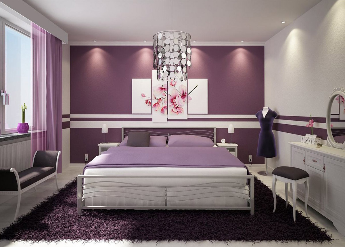
2. Liseran purple
Soft shades of grey-based lilacs and deep, rich aubergines are some favourite colours as they both provide for a relaxing environment. Liseran purple is a strong reddish purple that is bluer, lighter, and stronger than average fuchsia purple and redder and paler than purple orchid. Light, bright and feminine accents and soft furnishings will also help to lift the colour rather than create a sombre feel with darker colours. Maybe, try colouring one wall and see how you like it! Here are our tips for beginners or for DIYs.
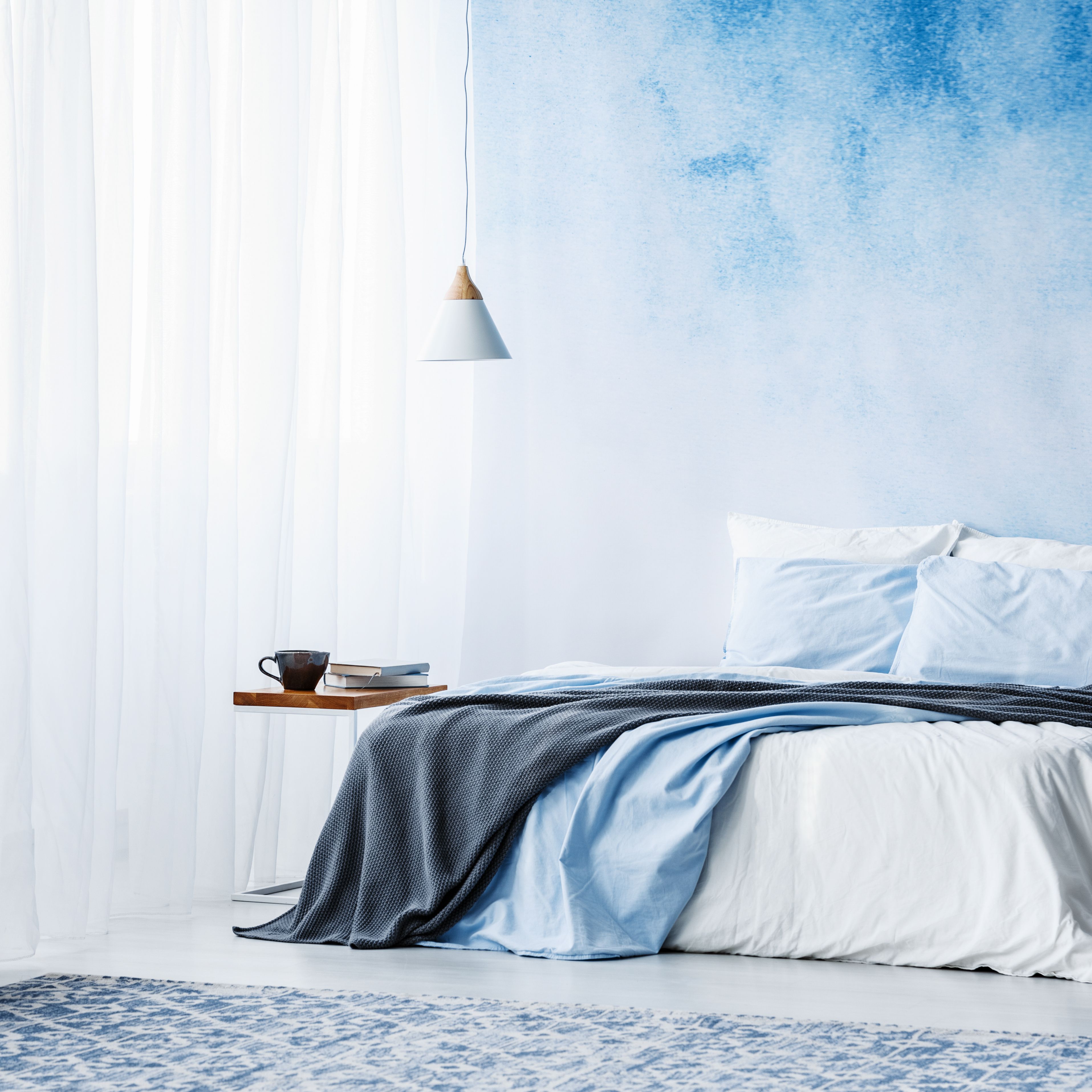
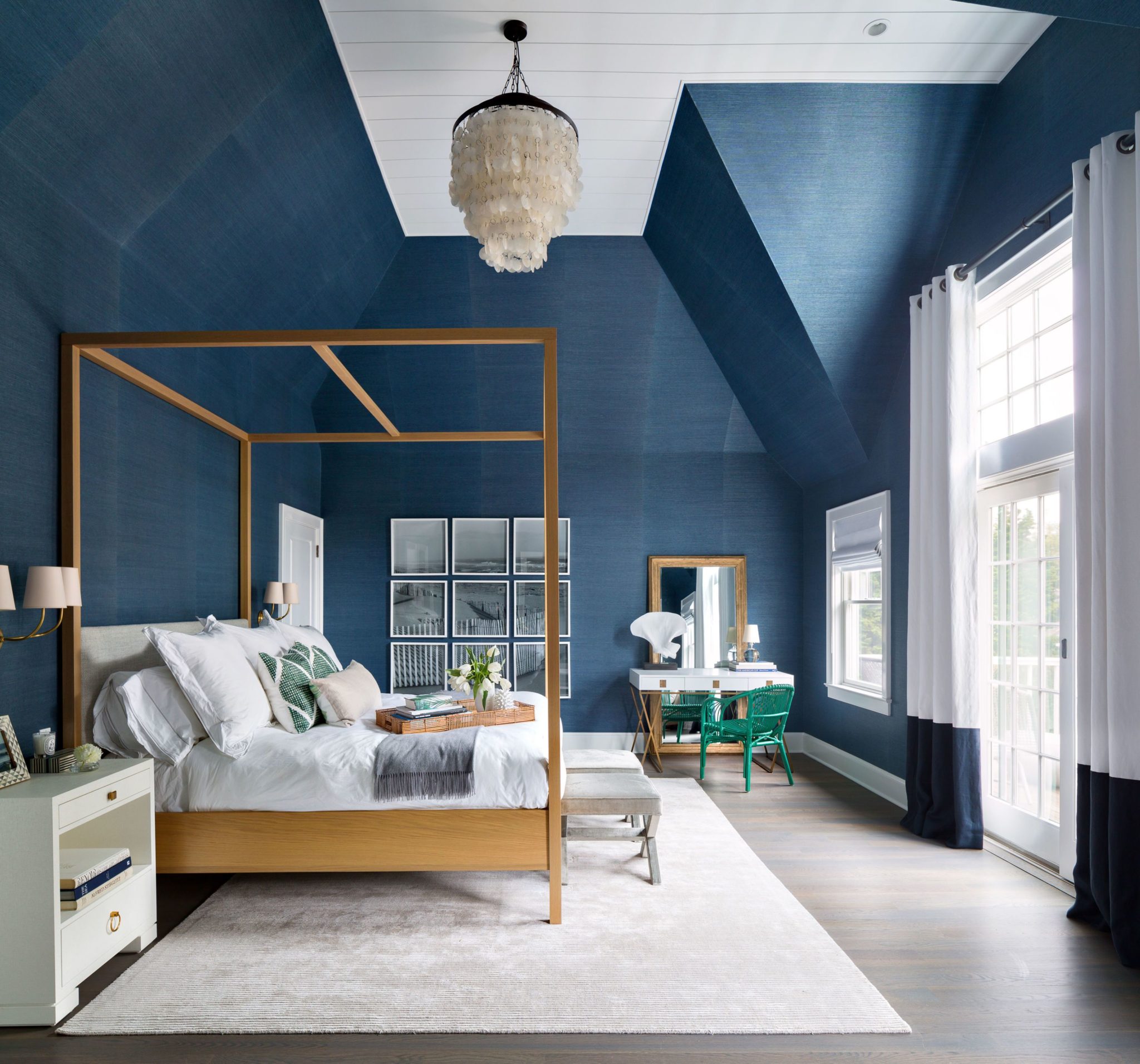
3. Pale blue
The soft pastel shade of blue gives a calming and relaxed atmosphere within the room, and provides an elegant backdrop while a deeper shade of blue can also be used to add necessary warmth to bigger rooms. Just as one would expect a slate color to be, this brighter grayish blue offers hints of lavender that make the room absolutely stunning. Pastel blue provides the perfect setup to go rest, take a load off and drift into a peaceful sleep in.
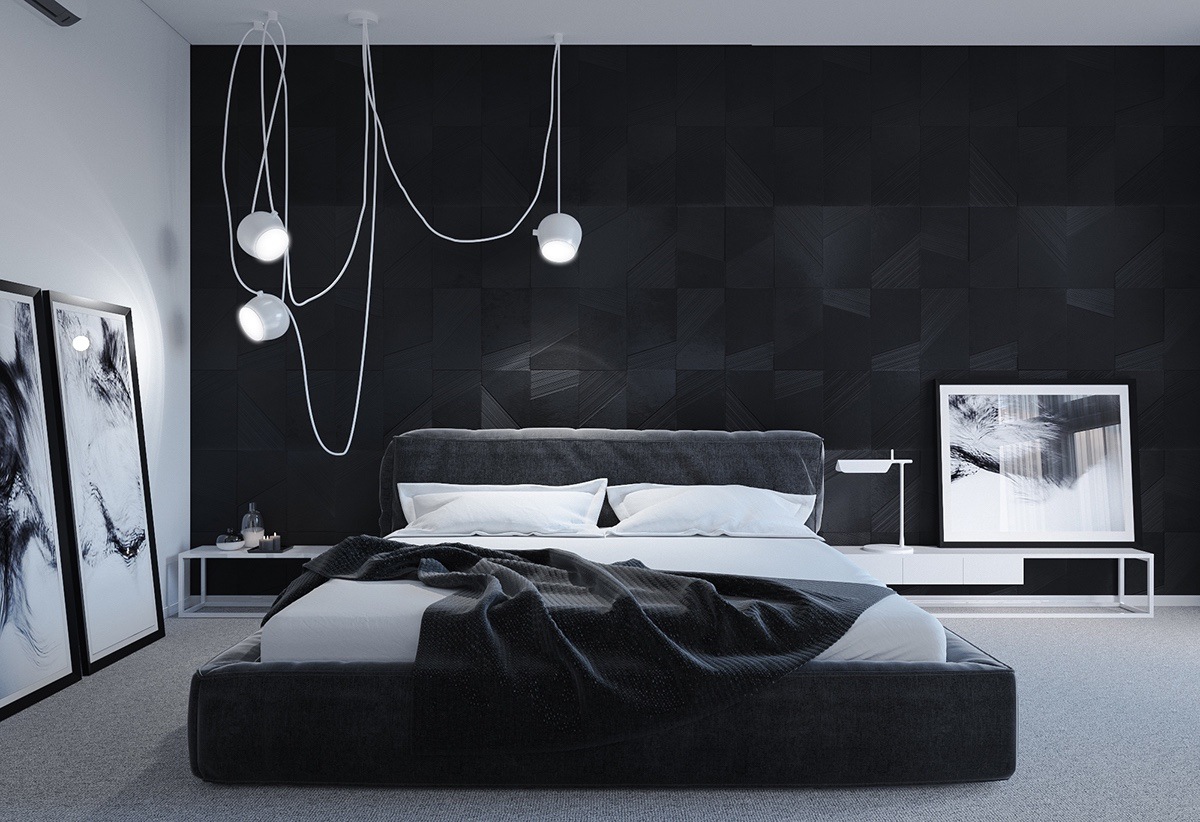
4. Black
Black also looks great in industrial-style spaces, with high ceilings and gives a sleek and clinical look to the room. Adding a range of contrasting materials around the wall to balance its strength – such as the timber ceiling and exposed brick walls in this room. Adding black or dark grey to the room with cream bedspread and light furnishing provides the room with depth and a minimal look. The black looks anything but oppressive and cave-like, thanks to the huge doorway and white furnishings. Don't try to DIY and ruin your furniture, get 3 free quotes from local painters.
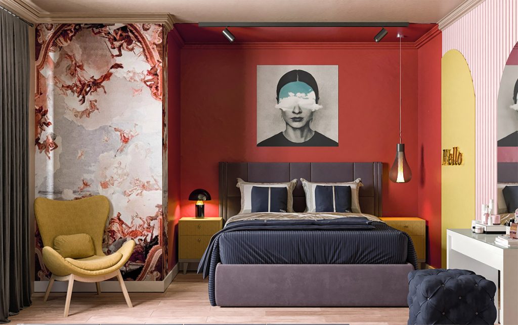
5. Rich red
Our favourite bedroom colour is this color is a rich shade of crimson-rose. It is easy to shy away from bold colours but the right shade can give a wonderfully rich and cozy feel to the room. It evokes the images of a fireplace which makes the room warm and inviting especially for the winters. You can pair up the royal red walls with pale colours such as white, cream and yellow or even darker colours such as black or grey. Very versatile!
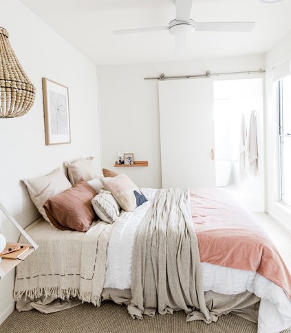
6. Neutrals
While most people still tend to stick to safe shades of white or cream for the walls of their sanctuary, they are certainly not the only hues that work to create the necessary tranquil and relaxing vibe for this important space. Colours such as dusky pinks, caramel, light grey, ivory etc work well to create a light-filled yet serene space to retreat to. These colours can easily be paired with bright patterns, lively blinds and other small details such as mirrors and furniture upholstery or soft furnishings. Neutral colours are also a great option for the exterior of the house. Find out how much it costs to hire an exterior painter.
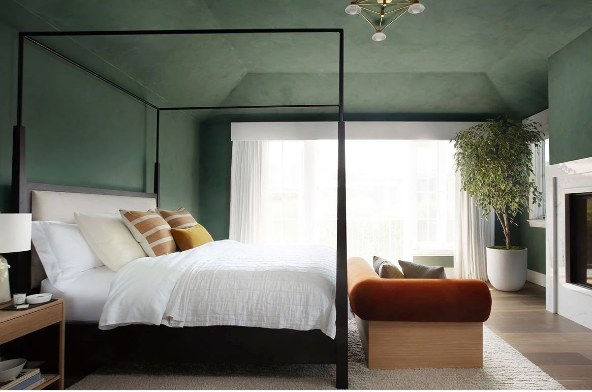
7. Moss Green
Moss green is the perfect combination between a bright green colour which is sure to be eye-catching as well as make the room feel happy and pleasing to be in and pale green which gives a more serene and subdued vibe. It can also be a great option for the kids bedroom or a swanky art studio. Soft mossy tones can also look beautiful and wonderfully serene, especially when paired with light timber details and accents as in this room. Learn how to decorate in green and help you highlight that space. Surprisingly, despite the green undertone, it can be paired with a wide range of colours – white, taupe, pale pink, red, light tangerine, black, or even navy blue, are some of our favourite combinations with this colour.
Get free quotes in minutes.
Get quotes from our qualified and licensed tradies Australia wide.